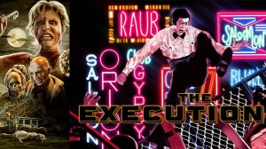
If you’re familiar with our release of Gamera: The Collection then you will have seen the incredible artwork both on the cover and throughout the boxset. This was all designed by comic book artist and illustrator, the Kaiju King himself, Matt Frank. He’s also designed our amazing cover for Tremors and X-Ray Graboid poster (out on UHD and Blu-ray December 14). We caught up with Matt to have a chat about his career, his work for Arrow and film art in general.
Arrow: How did you get into illustrating?
Matt: Like most kids, drawing is something I did just to stay busy and be creative. Actively pursuing illustration as a career didn’t really occur to me until perhaps high school. I was deeply inspired by the creative process of Japanese manga makers and was only scratching the surface towards learning about comics. Funny books in general seemed like the way to go, and early on I picked up odd jobs like Bluewater Productions’ “Ray Harryhausen Presents” comics. My career didn’t really take off until I started working with IDW, first on a smattering of Transformers titles, then I hit what one would call “big time” when I was hired for regular work on their various Godzilla comics. Since then I’ve jumped around a lot, but comics are only a part of my overall palette of artistic expeditions.
Arrow: What initially inspired you to focus on kaiju (monster) artwork?
Matt: It’s funny how often folks as “why kaiju though?” - not that I mind the question! It’s a niche genre that’s hard for folks, especially in the Western world, to wrap their heads around sometimes, mostly because “monster culture” isn’t as pervasive over here. But when we’re young, a lot of kids get locked in on certain stimuli, and it coalesces in a love for particular franchises like Star Wars or Spider-Man or what have you. For me, it wasn’t just my love of dinosaurs, which most kids fall for. That love expanded into movies like Godzilla, which then led me to Gamera and the rest of the kaiju genre. In addition, the cavalcade of Japanese media that dominated global pop culture in the late 90’s and early 2000’s reinforced my core love of kaiju. As I got older, I never left that love behind - in actuality, learning more about the process of “tokusatsu” and the artists behind the monsters catapulted my love from mere childish obsession to active attempts at historical documentation and, for lack of a better term, proselytising. Kaiju as a genre is, all at once, shockingly complex, deeply political, wonderfully ludicrous, and extremely under-appreciated. And all the while, I feel that at some level it *must* still appeal to kids because THAT’S how you get new fans.
Arrow: Which artists have you been most influenced by?
Matt: Man, I got a laundry list. On the comics side of things, I’m definitely inspired by folks like Art Adams, Ricardo Delgado, Juan Díaz Canales and a TON of Japanese manga artists. Concept artists like Shinji Nishikawa, Mahiro Maeda and the crew behind the Monster Hunter games are up there as well. Then you get illustrators who play in a lot of different fields like Tohl Narita, Bob Eggleton, and William Stout who have greatly inspired me. And I’ve made sure to study classic masters like Gustave Doré and Van Gogh (I went through a whole Impressionism phase in college and my parents still have those paintings).
Arrow: What tools do you use to produce your artwork?
Matt: I surprised my friend Sophie Campbell (TMNT artist for IDW and avid Gamera fan) the other day by sending her pics from my regular ol’ sketchbook. It reminded me that a LOT of working artists these days tend to work almost entirely digitally. And I’ve done my fair share of all-digital work, but something about the tactility and intimacy of pencil and ink still excites me and helps my creative process. Even “all digital” pieces for me usually start with quick pencil sketches to lay down the groundwork! So MOST of the time my work begins with pencil and ink and Bristol board and usually moves to digital for clean-up, edits, and colouring.
Arrow: Have you received any memorable reactions to your artwork?
Matt: Absolutely. Twice now, young fans in Japan have actually burst into tears of joy when they see the convention sketches I’ve made for them. Like...I didn’t think it was possible for someone to have that emotional of a reaction to a relatively minor Ultraman character, and I’m the guy who cries at the end of Kong: Skull Island (John C. Reilly is a treasure). Over the years I’ve gotten lots of warm wishes from various fans at conventions and online, but one of the most striking impacts I had was when I learned that a new friend told me about how Godzilla: Rulers of Earth, one of the comics I worked on for IDW, kept her going emotionally during an extremely difficult time in her life. It really meant a lot to me and it’s interactions like that which remind me why doing what I do matters on some level.
Arrow: Which Arrow cover are you most proud of working on?
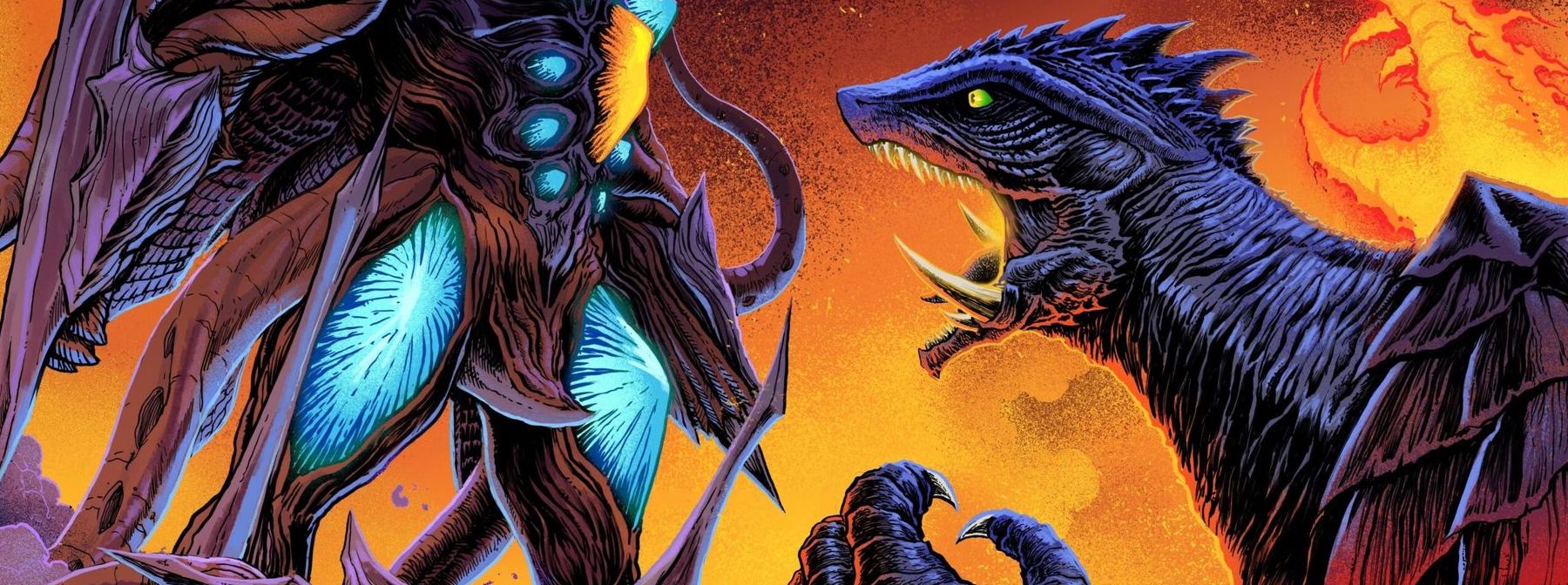
Matt: Ah jeez don’t make me choose! I mean seriously, I literally can’t. The overall Gamera set was a joy and I’m tremendously proud of it, but Tremors was a step out of my usual “cram it all in” comfort zone...hopefully there will be more down the line so I have more to pick from! Otherwise it’s just gonna be a dozen Gameras or Tremors! But I think the way the colours play off each other on the Gamera vs Gyaos cover is very artistically satisfying.
Part of the challenge of the Gamera collection was that I started by individually drawing each monster and then had to Frankenstein them together for the individual posters. I was lucky that so many of them came out looking pretty darn good but I do think the Gyaos poster “sings” the most between it’s colours and how the monsters complement each other, not to mention I managed to work the volcano in there! It’s the one that I managed to trick people into thinking looks the most like a real movie poster! The front cover and the covers for the Comics Collection and the essay book I approached with more traditional illustration/movie poster/graphic novel design techniques.
Arrow: For the Gamera set, was there a particular part you enjoyed working on the most?
Matt: Oh man, the whole thing was just so much damn fun. Despite how difficult it was, the commentary was an engaging and unique challenge. But ultimately the most pure “fun” aside from getting to draw all those beasties was getting to do the research for said commentary. I got to talk to a lot of amazing people and truly research the creative process for a film that doesn’t have a ton of English language documentation! That was a joy.
Arrow: For your work on Gamera and Tremors, how long did it take to go from initial idea to finished design? And how do you usually begin? Do you watch the film or look at stills for inspiration?
Matt: Gamera was a considerably longer process than Tremors! Granted there were 12 Gamera films to consider. But they all start with barebones concept sketches. Usually firing them over at James, the disc producer, for opinions and feedback. In general Tremors was a much smoother process because there was only one film to consider and James did a lot to help nudge me in a particular direction that felt fresh. Gamera involved a lot more trial-and-error and fumbling around because I wasn’t quite sure how the whole thing was gonna look when it was all together so I took some risks and thankfully it paid off! Sometimes a cover can take a week’s worth of time, others can take just a few days. It depends on my own workflow! And watching the films is hugely helpful although sometimes digging up concept art and production photos can be indispensable.
Arrow: Is there a difference between drawing for a comic book cover and cover art for a film?
Matt: Yes and no. You want something eye-catching in both respects, and illustration in general, comics OR film, require adhering to a handful of helpful guidelines like the Rule of Thirds and general image balance and colour theory. However, comics tend to be reflective of specific moments in a story intended to grab a reader while sitting on a shelf. In the old days, extremely ridiculous situations were put front-and-center, like Superman trying to murder Lois Lane, in order to entice someone to figure out “what the hell is gonna happen?!” This isn’t universal but it’s a pretty standard approach.
Movie posters have to capture a general feel of a film or hint at the overall plot or story somehow. Or maybe just showing off actors whom audiences like, if it’s a comedy or drama of some sort.
Kaiju movies have their go-to standards; in the old days, and even today, the actors are usually screaming in horror as a titanic beast bares down on them, or clashes with a rival in city-destroying fury. But often you’ll find it depends on what kind of movie it is, because like all genres, not all kaiju movies are the same. Sometimes you’ll get something like Colossal which had a handful of very minimalist posters in addition to the standard “Here’s our actor and a monster but it’s WACKY” poster (which doesn’t really reflect the film in my opinion...God that movie is so good). But yeah, in general, a movie poster is about the overall feeling or vibe rather than a single moment reflected in the text of the film itself.
Arrow: What’s your philosophy behind good film artwork?
Matt: As I said, it’s about capturing the overall feeling of a movie, and that can take a lot of forms. That’s why so many truly great posters are very minimalist, like the first Jaws 2 poster - it’s just an image of the ocean surface with heavy contrasts and deeply upsetting reds and oranges from a setting sun, but the shark’s fin is visible, breaking through the surf, but it’s off-center, only visible in the sun’s reflection which gives you this uneasy feeling that you wouldn’t have seen it otherwise. It’s immediately disturbing and excellently made. More complicated posters are a combination of images and moments kinda mashed together, but should be assembled in a way that is visually appealing and draws the eye towards one central dynamic, a challenge for any artist working with a lot of characters and elements (lord knows I still struggle with it).
The greatest movie poster artist of all time, Noriyoshi Ohrai (fight me) is the MASTER of epic scale and dominating imagery. His Godzilla vs Biollante poster takes my breath away even to this day, and it’s relatively simple given that the focus is JUST on Godzilla, but the rest of the frame is DOMINATED by the massive form of Biollante who looks like she’s taken over the entire world (I got to see that original art in person and had to be mindful of the security guard getting fussy with me for being so physically close to it).
Either way, the idea is “here’s the movie in one image!” and that can be challenging both compositionally and creatively since you don’t want to give away EVERYTHING but you want to give away juuuuuust enough...not unlike a really well made movie trailer. I don’t care for a lot of more recent modern big budget movie posters because it feels like market-tested photoshop algorithms vomited all over a 24”x36” sheet without any real sense of balance or even a hint to the story. It’s just “LOOK AT OUR ACTORS!” and nothing else artistic or substantial. That’s why I keep an eye out for fancy art poster alternatives like The Shape of Water (total brag here: mine is signed by Doug Jones!)
Arrow: If you could design a cover for any film, what would it be?
Matt: Well I couldn’t just pick one! I’d relish the opportunity for more focused, slightly more subtle movie posters...maybe something like Alligator or The Blob. I would LOVE to take a crack at a proper poster for Jurassic Park. Or maybe Daimajin...I mean I might just wind up listing kaiju movies! Something WITHOUT monsters could provide a unique challenge as well...also I loved me some retro sci-fi...Augh! Now you’ve got the old wheels in my brain turning!
Arrow: And finally, from the Gamera collection, which is your personal favourite film?
Matt: It’s truly very difficult to choose between the three films in the Heisei trilogy...Those films really do function at their best when watched in sequence, although they are excellent on their own.
Lemme put it this way: my favorite of the originals is Gamera vs Gyaos, I love the Heisei Trilogy as one big narrative, and Gamera the Brave is an unappreciated gem that deserves about 14 years’ worth of retroactive affection to make up for lost time.
For more info on Matt and his work you can find him on his website, Twitter or Instagram.
For the latest from Arrow Films, follow us on Instagram, Twitter, Facebook, and YouTube.

